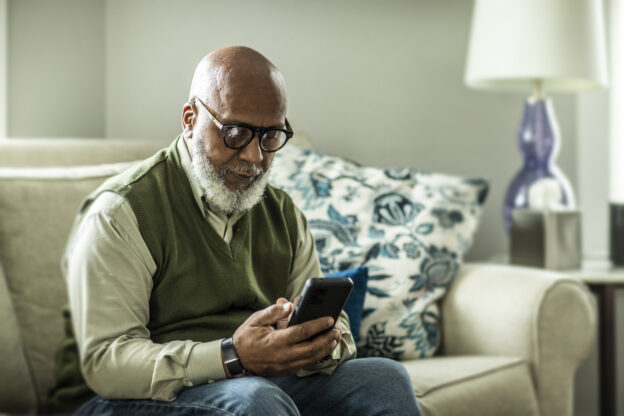
As universities increasingly turn to apps to improve communication and campus experiences, it’s essential to be sure they work for all students and staff.
In June 2022, the University of San Francisco launched the campusM student engagement platform under the name USFMobile. When Craig Duffek, a master’s student at the university with visual and dexterity challenges, ran into roadblocks with the app’s accessibility, he became an advisor to Dave Hyman, USFMobile product manager. We talked to Craig and Dave about the importance of app accessibility and the advances that happen when users and developers collaborate.
Q: Craig, is web accessibility a critical issue for you?
[Craig] 100%. I am a member of the National Federation of the Blind, a nonprofit organization in the United States. This year’s priority when we go to Washington [to lobby] is web accessibility. We want the government to address this because it’s an issue we deal with constantly.
Q: Craig, how did you get involved with the USFMobile accessibility project?
[Craig] Last November, we were still doing short health surveys to get onto campus as part of our COVID-19 protocol. I went to the Student Disabilities Services (SDS) office and said, “Guys, I can’t do this.” To fill in the form, it was forcing me to turn off the screen reader I needed to interact with the survey.
SDS put me in contact with Anna Jaeger [USF’s former senior CRM technical manager], who connected me to Dave.
[Dave] At the time, I didn’t realize that Craig and other visually impaired students were having this issue with the survey — and it was a big issue. If you didn’t pass the three-question health survey, your door pass wouldn’t work for classes or dorms.
I think the timing worked out well because I was looking for beta testers for the app pre-launch. Our chief technology officer was great in ensuring we had a fleet of beta testers and I made sure to earmark a dedicated tester for accessibility, so we could get user standards and compliance right. And that tester turned out to be Craig.
Q: Can you give me an example of how Craig has helped reshape the USFMobile app experience?
[Dave] Sure. The current mapping program we use at USF can be difficult to use if you have dexterity issues.
[Craig] You have to use two fingers to scroll around.
[Dave] Craig commented, “That’s not going to work,” and then he showed me how not being able to precisely control the map was leading to real usability issues for navigating the campus map. To completely solve this will require a multifaceted approach that will take some time to fully realize. Initially we will be providing a dedicated experience for those students to help them find their classes by providing turn-by-turn style directions to their classroom(s) without having to rely on the campus map. Simultaneously, we are working with the mapping program vendor to find a solution to address some of the usability issues that we ourselves cannot fix, ensuring that the experiences we offer our users meets USF’s standards for accessibility.
Q: Craig, what’s been the most impactful change in the app since you started advising on accessibility issues?
[Craig] A big deal for me was that Dave put the SDS button on the app homepage. Before that, it was just buried in the USF website.
Q: Dave, are there additional examples of ways you’re working to improve app accessibility?
[Dave] Definitely! I would say that a specific thing we rolled out when we switched from our legacy app to campusM in June 2022 was our Transit page (built using the Application Extension Kit), which displays real-time arrival info for buses around campus. Craig pointed out that we didn’t have alt text [the written copy that appears in place of an image]! But then I thought, if we just write “picture of a bus stop,” that’s not really going to help. So, we went picture by picture to provide rich, accurate descriptions to help someone who has vision challenges to have a better chance of knowing they are in the correct place. For example, one of our bus stops is in front of a large Target store and our alt text now mentions that not only does this bus stop have a shelter, but it is in front of Target. The idea is that if someone needs to use our alt text description, it should be descriptive enough that they know when they’ve reached the correct location.
Another important feature we’re working on to enhance wayfinding on campus is pulling students’ schedules and providing turn-by-turn written directions to their classroom.
In addition to consulting with Craig, I try to take the SDS’ feedback into consideration, so we can make the app experience better for everyone.
About Dave Hyman
Dave Hyman has been working at the University of San Francisco since November 2021, making sure the university’s mobile app (USFMobile) meets the needs and standards of USF’s students, faculty, and staff. Prior to joining USF, Dave spent the last 10 years working as a product manager for companies both big and small in the San Francisco Bay Area.
About Craig Duffeck
Craig Duffeck is from Neenah, Wisconsin. Craig has a bachelor of arts in history and is currently enrolled in the master’s of Asian Pacific studies program at the University of San Francisco. Craig has been advocating for the rights of all disabled people for the majority of his life, as someone who is blind and has cerebral palsy. Craig’s hobbies include hunting and fishing, watching NFL football and MLB baseball, as well as listening to various genres of music.